Jesse Squires recently asked on Mastodon whether SwiftUI still lacked support for dynamic colors. Ultimately he shared a solution that uses UIColor / NSColor under the hood to achieve the desired effect. There are other solutions floating around that work in a similar way, like one from John Sundell.
We’ll need to keep doing that as long as we need to support iOS 16 and earlier, but with iOS 17 and aligned releases SwiftUI finally has a built-in answer for this: custom ShapeStyles.
I’ll start with a quick question that may be on your mind: what do shapes have to do with colors?
foregroundColor(_:) is Deprecated
In case you missed it, iOS 17 et al. have deprecated the foregroundColor(_:) modifier. Instead, Apple says to use foregroundStyle(_:). You’ll note that foregroundStyle(_:) takes a ShapeStyle, same as background(_:ignoresSafeAreaEdges:) which you’re probably already using extensively.
As it so happens, Color conforms to ShapeStyle. So in many cases you’ll be able to replace usages of foregroundColor(_:) with foregroundStyle(_:) without changing what you’re passing.
Migrating to foregroundStyle(_:) also means we can leverage iOS 17’s new support for custom ShapeStyles to create dynamic colors!
Custom ShapeStyles
Before this beta season began, the documentation for ShapeStyle led off:
You don’t use the
ShapeStyleprotocol directly. Instead, use one of the concrete styles that SwiftUI defines.
Now it starts:
You create custom shape styles by declaring a type that conforms to the
ShapeStyleprotocol and implementing the requiredresolvefunction to return a shape style that represents the desired appearance based on the current environment.
It goes on to show an example of changing a color’s blend mode based on the environment’s color scheme.
But we can also use this to switch to an entirely different color! Here’s an example of a ShapeStyle that resolves to a color that’s based on the current color scheme:
struct DynamicColorShapeStyle: ShapeStyle {
    let light: Color
    let dark: Color

    func resolve(in environment: EnvironmentValues) -> some ShapeStyle {
        if environment.colorScheme == .light {
            return light
        } else {
            return dark
        }
    }
}
You’d use it like this1:
Text("Hello")
    .foregroundStyle(DynamicColorShapeStyle(light: .red, dark: .yellow))
It’d be nice if we didn’t have to write out “DynamicColorShapeStyle” all the time though. Luckily we can write a little extension to improve this:
extension ShapeStyle where Self == DynamicColorShapeStyle {
    static func `dynamic`(light: Color, dark: Color) -> DynamicColorShapeStyle {
        DynamicColorShapeStyle(light: light, dark: dark)
    }
}

// So now this works:
Text("Hello")
    .foregroundStyle(.dynamic(light: .red, dark: .yellow))
And that’s it! No need to fiddle with UIColor or NSColor anymore to create a dynamic color in SwiftUI 🎉
I have to say, this doesn’t feel very intuitive at first. I think people who need a dynamic color will look for some kind of Color initializer like Jesse did, not something that sounds totally unrelated to colors called ShapeStyle. I only noticed this while reading Apple’s WWDC23 notes about notable SwiftUI changes after seeing Jesse’s question. And even then, it was under the “Shapes” section, which doesn’t feel related to colors initially!
Digression about HierarchicalShapeStyle
Writing this post was the first time I had really used foreground styles, so I wanted to mention some neat behavior I noticed when I was playing around with them.
Setting a foreground style on a container view causes HierarchicalShapeStyle to inherit that style throughout the child hierarchy. This means that using .primary will resolve to whatever the current foreground style is. More interesting, using .secondary, .tertiary, and .quaternary resolves to lightened versions of the foreground style.
Consider this code:
VStack {
    Text("Background")
        .foregroundStyle(Color.primary)
        .padding()
        .background(.secondary)

    Circle()
        .strokeBorder(lineWidth: 5)
        .fill(.secondary)
        .frame(width: 100, height: 100)
}
.foregroundStyle(.dynamic(light: .red, dark: .yellow))
Here’s how that renders:
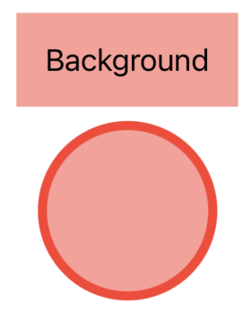
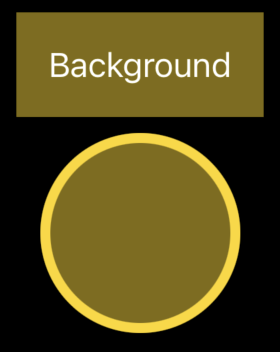
Note how using HierarchicalShapeStyle.secondary (abbreviated to .secondary in the code sample) automatically gave us a lightened version of our red/yellow color without us having to define an extra color. Similarly, .tertiary and .quaternary resolve to even lighter versions of our foreground style.
Also note how we had to use Color.primary rather than just .primary for the text to get black/white. If we had used .primary, it would have resolved to HierarchicalShapeStyle.primary, so the text would have been red/yellow instead of black/white.
Next Steps
ShapeStyle can do a lot more than just plain colors. Majid Jabrayilov wrote about ShapeStyle and what else it can do. I encourage you to give that a look!
Again, to get a little Xcode project with the code from this post and a little more, check out this GitHub repo.
Thanks for reading!
This example is a little contrived. If you know ahead of time what colors you want your dynamic color to resolve to, you’d be better off defining the color as an asset instead. But if you won’t know what colors to use until runtime (maybe they come from a server or user input), then you’re in the right place! ↩︎